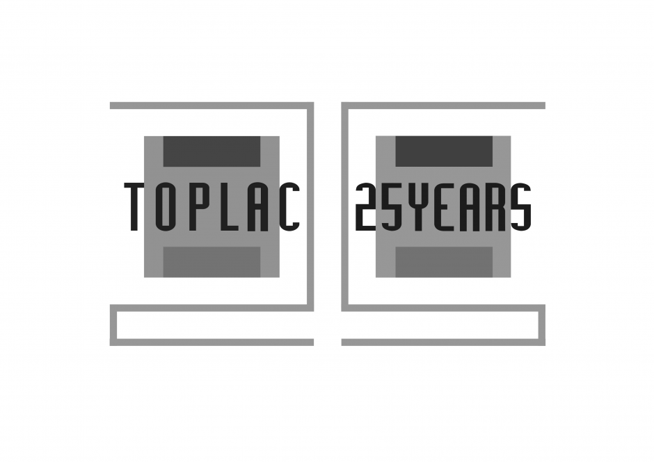
Návrh #46 v soutěži Logo Toplac k 25.výročí společnosti

Vložen
18.11.2015 9:57
Poslední aktualizace
18.11.2015 11:00
Získané hodnocení
dosud nehodnoceno
Tento design se líbí 0 uživatelům

1. verze
vloženo: 18.11.2015 9:57 poslední aktualizace: 18.11.2015 11:00Designér k návrhu nepřipojil žádný popis.

Komentáře
Komentáře již nelze přidávat.
-
nahlásit oolailai
-
nahlásit oolailai

Designed by a professional logo and branding designer from London, currently residing in Prague. By showing the original logo twice - the logo is reinforced. By using the same typography for "25 Years" - the brand identity is reinforced. This celebration logo does exactly that, it celebrates the brand and stays true to its values. Existing customers won't be disillusioned because this looks new yet familiar. New customers would get to know the brand and its existing identity.
18.11.2015 10:07


Plus there would be greater respect, for the brand has resisted from following the herd and following a temporary trend. Instead, it had decided to stay loyal to its existing identity. Don't throw away your 25 Years of history with a logo that your loyal customers won't recognise. Don't be trendy. Be enduring. Be memorable. Here's to another 25 years.